Precise Sadness | |
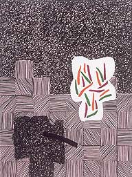
| Two titles of Jonathan Lasker paintings give away the key to his work: 'Brainiac in Self-Regulating Environment' and 'Precise Sadness.' These are astonishingly accurate self-descriptions. It was a special pleasure to see this Lasker show about two weeks after seeing a small show of Milton Resnick's work at Nielsen Gallery on Newbury Street. Resnick is about 82 and Lasker is 52. Resnick the last survivor of the first generation of Abstract Expressionists or New York School. Both like to use thick paint - sort of - but that's about as far as we can try to link them. There's a great quote by Robert Hughes in this 1985 Resnick catalog: 'Resnick's paintings . . . are controlled by an iron will to form. Except that the forms do not become explicit; they remain stored in the pigment like warmth in stone.' (Time, May 29, 1972). (I just noticed that this catalog, on interlibrary loan, was given to the Amherst College library by John Ashbery.) (Is there any significance here? Suppose not.) Resnick's paintings are famously heavy. His max out was 400lbs of white paint on a big painting in 1963 which he says got him through a bad time and which he called 'The New Bride.' The late paintings I just saw were relatively small, but still there was a lot of paint massed behind what you could see. They were mostly pretty dark and the colors did fuse and glow in ways that made me like Hughes' comment about the 'warmth in stone.' The thick paint on Lasker's pieces looks like wedding cake icing and you think you could easily break off a piece, pop it in your mouth, and suck on its icky sweetness until it finally melted. It looks pasted on and as if it was extruded from a big pastry bag with nozzle to make such perfectly even and uniform squiggley edges. Everything about the paintings is perfect. I've never seen paint so perfectly controlled and made to work like pencil and marker and mousse or gel. (Except Lichtenstein's paintings, a recent show of 'oriental' landscapes - he controls paint like it is silkscreen ink.) If there were a Mondrian in the same room it might look sensuous. There are careful brushstrokes evident (way too evident) but even these seem to make the paint look like sweet icing. Of course the paint is often pastel blue or lavender or pink and that adds to the Necco Wafer look and potential feel of it. These big impasto strokes have a slight gloss but over all everything while you know it is oil really looks like acrylic, heavily gelled. Strange. Viscerally the paintings feel extremely brainy and supra-intelligent and cereberal and hyper-planned. You can see they have been made by hand but the look and feel like they are computer graphed and executed. Viscerally, then, kind of fascinating-creepy, like all the kinesthetic-visceral quality of paint has been cyber-leached out (as opposed to physically drained out as in the way Ad Rinehardt got his blacks to be dry and matte). The paintings are compelling and stunning and brilliant to look at. There's a great deal going on. Lasker knows well his antecedants and ancestors - allusions and references to Agnes Martin, Ryman, Ellsworth Kelly, Marden, and Warhol. You don't think of Rothko. One curator says Still was an early influence because Lasker went to school in San Francisco and he uses a palette knife occasionally but I can't see a Still in his work. The knifed paint looks like icing and nothing like Still. Warhol comes to mind because the overall look of the paintings is so sharp and commerically in your face with its graphic clarity and power. And because the technique is so perfect and flawless. I did see one drip and smudge on one painting and what a relief it was to see it. The portions of black loopy small line squiggles, like opened black balls of string - these look at first glance like they're a reference to Pollock perhaps - doodles, and Twombley - but as you take them in you see how terribly planned and controlled they are. One citation says the work was made with 'paint marker.' There must be available magic markers that use oil now. I don't know. But that's what the lines look like, ballpoint oil pen marks. If he uses actual brushes to make them they are even more amazing. |
 | And that's another effect. Thirty years after Resnicks and DeKooning the Best Student in the Class has figured out how to make paintings that are non-representational - he says they are not Abstract works - in which you admire the skill at once. 'Wow! These are so difficult and good. How did he do this?' Included in the show and the mythology are drawings and sketches that Lasker uses and you see at once how the display of technique is essential. These drawings are in fact more like maquettes - and I'm so happy I thought of that before reading the essays. They are miniature paintings, models and templates and blueprints. Using them, any number of studio assistants with a little of the correct training, could produce the large works, so there is an echo too of Sol Lewitt's process of creativity and making. These paintings have been fabricated and the paint feels more as though it has been used not so much like paint but like the aluminum strips in a Frank Stella sculpture. Or like the dough shaped into pretzels or cut into tops of pies. Or even the sadistic leather straps in a Mapplethorpe photo! You can look at the intial plan-drawings for works and then look to see what changes Lasker made in bringing the larger painting into final execution from the original plan. Some viewers seem to be thrilled by this. (The Director of the Museum stopped to ask how I was enjoying the show, very thrilled with it.) Again, depending on lots of things, seeing too much Lasker makes you want to rush somewhere and look at some Franz Klines or De Koonings. Lasker can make you hunger for the vitality of gesture. Hungry as well for something like the fluid depths of Joseph Marioni's colors. The thick richly toned swirls of late Olitski. Color? He uses primaries at times and gets a kind of gritty bold yellow by mixing reds and blues into the yellow in some of the brushed marks. But these are some of the most frozen brush strokes in recent painting history. And color he seems to succeed in making as cold as possible too. Pale pinks, pale lavender, white-flesh pinks, birthday cake yellow and white, boudoir teals and blues and grays. One big orange piece that should be bright and vibrant and is and yet the flat pond of pink with blue, yellow and brown marks and the black lattice lines managed to flatten the orange from its wish to be firey. The figurations. The play of forms and doodle echoes and loopy variations. All very smart and bright and pattern pleasing, like the best of rap music? like Bach, like all the kinds of variations on themes that we like to see-hear in our cultural products. They are easy to see, there is no work involved. What you see is what you see is what is there in front of you. No stagey trickery to conure unseen powers or forces or tickles of suggestion. The ultimate mystery invoked is that there is no mystery, none to invoke and none to wonder about or wish for. Meaning is not a problem, not a question. Is this 'Whatever' art to the hilt? Let your eyes work through these easy brain teasers and relax and enjoy. Paintings for the new Who Wants to Be a Millionaire generation? A thirty minutes of attention that will pass quickly? Or is Lasker really synthesizing and advancing the state of painting into the new century in ways that will reverberate for a long time after the instruments have stopped moving? The paintings are definitely puzzling and fascinating in the ways they disturb and please. You cannot not admire them for their calm, brilliant brash confidence and virtuosity. They are nothing if not neo-Appollonian. I'd now love to get to Pittsburgh to see the Brice Marden show. 'Similar' meditations on what to do with line and figure and field and ground and color as Lasker's - the same generation - and yet from photos and descriptions Marden's work has gotten softer and more playful and subtle, going more toward mystery in ways opposite to Lasker's work. In a small wing off the main exhibition area there was a show of pieces from the Rose permanent collection that Lasker selected. There was a newly purchased late Agnes Martin - from 1997. The paint itself seems uneven rather than pure and perfect. Is it only in memory that a work by Martin takes on that perfection it never really has in person? This one has six bands, two pale parchment (Liquitex) and four in darker and lighter pale shades of cobalt. Other pieces in the show were a big blue and white Ellsworth Kelly, a Joan Snyder that looked like something left up in the attic for too many years with a piece of gauze running along the top and other pieces collaged into the paint. Some pale color field-like echoes from the 80 and 90s. ©Robert Garlitz 2000 Jonathan Lasker. Selective Identity: Paintings from the 1990s. Curated by
David Moos. |