 | One of the things I take most exception to when people talk about music, specifically when it is Pop, is that the only thing that matters is what it sounds like. It's probably because I am not a musician that I find that argument to be somewhat snobbish and short-sighted, but it seems more to do with the fact that such an argument seems to simply miss out on the pluralist nature of the medium, that which gives Pop it's defining quality; it ignores the other parts of the jigsaw that make up the whole. Things like the clothes people wear, the films they may say they like to watch, the sleeves the records come in. As a visual artist and as a designer, it's probably inevitable that I place importance on the last of those puzzle pieces, but I think it's a factor that you cannot ignore, living as we do in a world where visual currency is so central to so much of our culture. The whole concept of the designer ended up with a bad deal as the 1980s passed through its second half. Phrases like 'Designer stubble' became commonplace as a means of criticising the hyper-capitalist consumer degeneration, and in some circles the concept of things being well designed became anathema, became something to rebel against. That people missed the point, equating shoddy, scrappy visual presentation with 'political' statement was inevitable, and the glut of cut and paste with no imagination or of rainbow tie-dye abominations that was spawned was as much an example of hideous Post-modern aesthetic as the architecture of London Docklands or buildings that sprouted enormous Eggcups Ironic then, perhaps, that some of the most politically charged records of the time came wrapped in the best designed sleeves; and then again, perhaps not so ironic given that those records were also some of the most intelligently, artistic political comments of their era, and of course great design is always intelligent; something else so obviously missed in its idiotic wholesale rejection by some. |
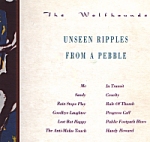 |
In the latter part of the '80s Pop world you couldn't get much more sharply, smartly political than McCarthy. With connections to the Revolutionary Communist Party and a love of the Pet Shop Boys, McCarthy encapsulated the ironies and contradictions of creating left-wing sympathetic Pop product, and as such cast a peculiar shadow on the schemes of Independent Pop. Agit-Pop without the slogans or dogma, McCarthy wrote songs that were avuncular and filled with a magically skewed beauty; wrote songs from strange points of view; wrote songs that made you think. Even more obtuse musically, though less overtly political lyrically, were McCarthy's regular label-mates The Wolfhounds. Wolfhounds wrote similarly jarring, cacophonously rapturous songs, by turns slow and sorrowful or fast and full of aggressive passion. Like McCarthy, theirs was the sound of proud, angry voices; an enormous sense of inner rage held on the edges of uncontrolled explosion. But control was the key: the rage seethed, the anger at injustices seeping through snarled barbs and sharp swipes. Both groups found little commercial or artistic favour in their lifetimes, and it is the groups formed by key members after their demise (Stereolab and Moonshake respectively) that history has been kinder to. But that's another story. This story is really about the bags that housed the records, and the man who designed the best of them. That man was Andy Royston. The two groups first shared label space on one of the finest of the post-punk Independents. Pink was not the perfect label (they released pre-Carter band, the only slightly superior Jamie Wednesday) but it came closer than most, notably through their early releases by June Brides and then later by McCarthy and Wolfhounds. Most of the Pink sleeves were by Chromatone Design and were restrained works. Certainly the first two McCarthy releases for Pink bore the modernist Factory/Saville stamp: 'Red Sleeping Beauty' employed spot-varnish to great effect (it's a safe bet to say that this sleeve was printed at the same time as the Pink 'It Sells or It Smells' compilation 12" which also used the spot varnish on black effect, as well as simple die-cut logo on the front), whilst 'Frans Hals' employed simple, elegant typography. I don't know if Andy Royston was involved with Chromatone, but he certainly was responsible for the design for the sole Wolfhounds album for Pink, the wonderful Unseen Ripples From A Pebble; a sleeve which is a great example of a beautiful inversion. Justin Ryan's loose, expressionist screen print is the dominant image, solely covering the back of the sleeve and spilling over to form a vertical band on the left third of the front. The remainder of the front provides a classic contrast, fitting beautifully spaced typography detailing track listing and the other information usually found on the back. It's a great design, where the contrast between strong order and expressive gesture perfectly reflects the taught passion of the Wolfhounds songs. |
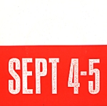 | When Pink ended in 1987, McCarthy went with the phoenix that was September, whilst the Wolfhounds briefly went to Idea, although after one single (a frankly inferior version of the Ripples opener 'Me'; the song that Richey Edwards once said 'remains one of the most intensely personal songs I have ever heard') joined McCarthy once again, ironically just as September itself dissolved. The political influence of the September label was made artfully clear from the outset. Connections with the cultural and political revolutions of the early twentieth century were obvious, from the name itself (as in the September Revolution, one assumes), to the clever appropriation of artistic imagery, something at which Andy Royston showed himself to be adept. The first September release was McCarthy's surging, sweeping 'The Well of Loneliness' and it came in a Royston bag predominantly of brilliant redorange, complete with simple bold typography, playing on a woodblock printing effect to come across as some activist poster (the woodblock printing idea was also used on the September logo and as such was an echo of the Pink logo which used the same effect). The reverse of the sleeve gave a knowing nod to the concept of the Avant-Garde too, with the group members photographed with their eyes closed, a la Surrealisme. |
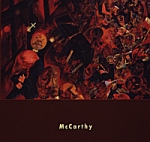 | With his next McCarthy sleeves, Royston followed along similar lines, taking the key artistic movements of the early 20th century and applying them with both wit and an obvious pleasure. For the debut McCarthy LP I Am A Wallet he used a painting by German Expressionist and Dada member George Grosz. The sleeve made no attempts to divert attention from the power of The Funeral Procession, fitting a small, sans serif typed band name beneath the painting on the front and a similarly simple use of text on the back, where the layout was essentially the same as used on Unseen RipplesÉ. The record insert, in black and white, followed the same layout rules as the coloured sleeve: on the front a photograph of the group at the end of Downing Street sat in place of the painting, whilst on the back the track listing was replaced by personnel credits. |
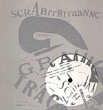 | From using German Expressionism, Royston next turned to the Futurists. The sleeve for 'This Nelson Rockefeler' lifting Marinetti's 'Scrabrrrraanng' work (the artist also gave Paul Morley the name for his Zang Tumb Tuum label) and printing it in silver on grey reversed board, with the design carrying through the central circular hole to the label inside. The sleeve reverse utilised the inventive typographic playfulness of Marinetti, repeating the 'scRABrrRrraaNNG' (there were great badges to promote the record that had only this text on them) and adding more rough block printing for the band name and song titles, contrasted with a winding handwritten text for the lyrics. The next single, the biting 'Should The Bible Be Banned' had another Futurist style text piece, in gold on dark brown, although this time the band name, the record catalogue number and the lyrics were inserted to appear part of the original artwork. In all of these September sleeves for McCarthy, Royston gave us perfect examples of the possibilities that lay in the marriage of political motivation with art. McCarthy were doing it with their music, and by making reference to a time when political intent was explicit and integral to visual art, Royston was both illustrating and educating. If only it were always thus. |
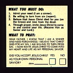 | Wolfhounds made just one record for September, the dark and raging 'Son Of Nothing'. Royston sleeved it in a bag that on the front overlaid a just off-focus photograph of what looked like a South American icon with a type that was edgy and off-kilter. There were also faint overprints of Mayan looking symbols, whilst on the back was the by now typically beautifully spaced type, around three cropped images, the left of which was a wonderful piece of text asking, with an appropriate tick box, 'Did you accept Jesus Christ as your own personal saviour?' |
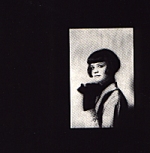 | There were a handful of other releases on September that were not by McCarthy or Wolfhounds, but which Royston also designed. Best of these was his darkly minimalist work for the criminally ignored Catapult. From the same London streets as the Wolfhounds, Catapult made a similarly dense racket, but if anything with even more tension, and a groove that was deep, driven and utterly addictive. The 'Sink Me' EP was perfect in every way, and Royston's stark black, grey and white sleeve included a pistol toting beat girl, brilliantly restrained type and stains that could have been blood or raindrops fallen on ice. Less of a success was the 'Goodbye Scarlet' single by Sara Davis, which was a record that sounded so flimsy and whimsical it hardly existed. The sleeve was pretty lazy too, and although it was spaced and composed to perfection, the pastel yellow and the photo by Anthea Seiveking were just too pale and fey to stomach. There was another single on September, by Brighton's 14-Iced Bears off-shoot Whirl, but I heard the record once and saw it not at all. If anyone can tell me if Royston designed this one, I'd appreciate a scan. |
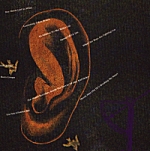 | With the demise of September, both McCarthy and Wolfhounds went to the European label Midnight, and Royston continued to design the sleeves for their first few releases on their new home. For McCarthy's The Enraged Will Inherit The Earth Royston returned to paying homage to the German Expressionists, pulling out a detail from Otto Dix's marvellous Prager Sraße painting of 1920 and juxtaposing it with what seems to be his most clearly computer-generated work in which a giant rust coloured ear floats on a heavy green ground, overprinted by song titles and dark purple silhouettes of what seem to be machine parts. September must have had some faith in the prospect of McCarthy making them some money, because the sleeve was a gatefold, with the inner being a terrific mock-up of an early century news-sheet. Lyrics for the songs were printed in three languages and were interspersed with basic litho prints of details of what seems to be a lock mechanism, a scalpel blade, and what appears to be a fairly brutal example of trepanning. |
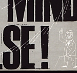 | The sleeve for the first single from the Enraged LP, the rousing 'Keep An Open Mind Or Else', made great use of the trademark woodblock type (of course!), along side a photomontage that was pure Norman Rubington and a caricature that could have been right out of Der Pleite, whilst on top of it all cascaded Malcolm Eden's barbed, venomously witty lyrics. The following single, the 'At War' EP which lead off with the monstrously good 'Boy Meets Girl, So What?' however, was a different matter. For whatever reason, Royston was no longer at the design helm, and the result was abominable; with a ridiculous red heart and horrific typography, it was, quite simply, one of the worst record sleeves ever produced, and the knowledge of the class of all that had gone before only made it so much harder to bear. The McCarthy sleeves that followed were only marginally better: 'Get A Knife Between Your Teeth' had a passably suitable starkness, whilst the band's final LP Banking, Violence and the Inner Life Today had an image 'based on' Seiwert's 'Die Arbeitsmanner' painting and typography only slightly less horrific than 'At War'. It was a far cry from the marvel that sleeved EnragedÉ. |
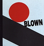 | Wolfhounds fared only slightly better: the 'Rent Act' single marked the last clearly credited Royston sleeve for Wolfhounds, employing muted brown and mustard yellow, with a blurred cityscape photo overlaid with drop-shadowed type on the front (and with peculiar little hand drawn 'o's on the upper case 'O's of the band name). The reverse used Royston's handwritten text once again, whilst overlaying the edge of the photograph floated a Yale key, printed in the almost photogram style. Their LP Bright and Guilty had no design credit, but it looked good enough to have been a Royston creation, with it's dense mixed media painting utilising snatches of lyrics and weaving photo collage with gestural brush expressions, overlaid with the same typography as used on 'Son of Nothing', the letters this time more obviously hand-drawn and then collaged on top of the painting. The third Wolfhounds LP Blown Away similarly had no sleeve credit, and it is possible that Royston made the decisions for this, and certainly the use of Eugenio Carmia's safety poster was consistent with his love of making use of visual history. The manipulation of the map of Antarctica for the front of the sleeve was wonderful too, although if truth be told, using a good map as the basis of a design is an easy way to assure success, simply because by definition they are by needs so graphically beautiful. In between these two LPs, however, there was the 'Happy Shopper single, the cover for which was simply despicable, being a lazy and uninspired pastiche of the chain of cut-price stores' own graphics, totally lacking in the sort of wit and passion that so obviously informed Royston's similar adventures with the Futurist imagery. |
After these sleeves it seems that Royston simply disappeared: certainly in the mid '90s when I asked Martin at Duophonic of his whereabouts, the answer was that no-one knew. Perhaps he moved on to stock design work, producing corporate logos and laying out year performance reports, but somehow I doubt it. I'd like to think that instead he stayed out on the edges, maybe moving into fine art, or maybe making strange films and maybe even great looking websites. In the end though, Royston left us with some great sleeves housing some truly wonderful records, and for that we should be thankful. And in the end too, if there's a message in the history, then that message is this: take inspiration from the inspired and you will most likely produce work that at least looks good: take inspiration from the uninspired and it's just as likely that you will end with something that is hollow and ugly. Surely the choice is a simple one? © Alistair Fitchett 1999. |